Sometimes when I see classroom décor on Pinterest, I get a little overwhelmed. I LOVE bright colors so much, but sometimes a mix of a lot of colors and patterns can feel a little too ‘busy’ to me.
For my upper elementary kids (4th grade), I really wanted to make my room cute but still simple and clean… but sometimes that’s harder than it seems!
When I first saw the Creative Teaching Press Chalk It Up! line at the EdMarket EdExpo last year, I swooned a little. THIS. This was what I was looking for- sophisticated and cute, but not overwhelming and distracting!
Here are my 8 tips for keeping classroom décor simple:
1- Use one color for all bulletin boards to give the room a cohesive look.

I try to use similar borders, too, so everything looks like it matches. You won’t believe what a difference it makes when they all look similar! My mom has fabric sheets instead of bulletin board paper so she can use them year after year.
2- If you want to try layering borders, stick to simple shapes and patterns.


This was the first time I’d ever layered borders, and after hearing how complicated it was, I have to say I was pleasantly surprised. Using a rectangular border on the bottom made it EASY for the borders to look really good.
The Dotted Swirl border is my favorite. The long, sweeping pattern makes my boards look longer than they are. I put the Lime Hexagons border behind it- a “solid” color from far away, but with a little detail and texture up close! Putting a bold pattern with a solid (or at least something close to a solid) really holds back the sensory overload.
3- Don’t be afraid to try something new.
As I started putting the borders up, I did the top and bottom and realized I kind of liked the look without borders on the sides… so with some confirmation from my friends on Instagram that I wasn’t crazy, I went with it!
4- Use what you have!
Why did I choose lime? Well, I like it- but more importantly, the lime color tied in well with the palm umbrella I’ve had for a few years (yay for “end-of-season” Big Lots finds!) and the dollar store baskets I picked up for my very first classroom. New teachers, pick a color or two that you love, and stick to them when you can!

It was funny to me that a couple of teachers at my school assumed I’d spent a lot of money redoing my room, but I had long been collecting containers in my favorite colors (turquoise and green), so when I used those colors and added just a few new details, it really didn’t cost much to give my room a fresh new look!
5- Don’t forget the text.
Little things go a long way in giving your room a little pizazz! For me, the Chalk It Up! letters were easier than making my own letters in the workroom, and added that extra element of cohesion when I used them around the room.
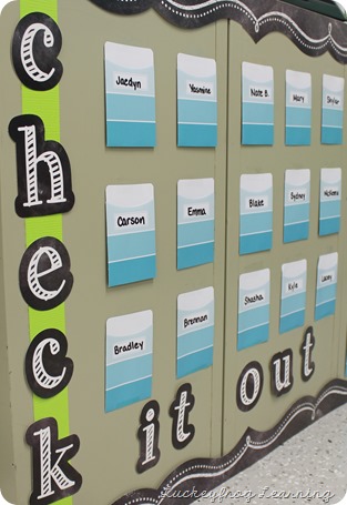
To make them stand out, I used green duct tape or green paper plates. LOVE how this Scientist board turned out! (I can’t wait to show you what else I’m going to add!)

6- Shop for deals- but be careful!
In the past, I’ve used a lot of borders I’d found for $1 at a dollar store or spot- thinking I was saving money. I finished my ENTIRE ROOM- well, minus the one tiny spot- with one pack of Dotted Swirl, one pack of Lime Hexagon, and one pack of the lightbulb pattern (with a lot to spare in this one!) Plus, the borders were a lot longer, so it didn’t take me as long to put them up. Pretty sure the “cheap” borders ended up costing me more in time and money, by the time I got enough for what I needed. Lesson learned.
Now, I did splurge on a few things- but I try to make those splurges something I will use for years to come, like my new sign from Tallahassee Sunday. (He’s so HAPPY!)

7- Don’t be afraid of white space.
Sometimes I look at a teacher’s wall and it’s as though they want everything a student will ever know to be plastered on the walls. I know that we need to have reference material for our students, but sometimes students don’t use the things we put up before they arrive- especially when it’s one little section of a COVERED wall.
There’s nothing wrong with a little blank space. Just ask Taylor Swift- and any kid in your class with ADHD.

It’s also okay if your room is not done on the first day, too. This is what my biggest board looked like when students arrived. Yes- with a stack of books, and a small piece of border missing because I ran out! Just a background and borders go a long way.
8- Function over fashion. Always.
As I said in my post about classroom design for new teachers, “You were hired as a teacher, NOT a classroom cutesifier.” Your class should be designed around the instructional spaces you need. I am big on using anchor charts, so one of my walls is almost completely blank- ready for me to hang the anchor charts we make together.
I teach 5 classes of science and 1 class of social studies and keeping track of make-up work for so many classes was a struggle- so this make-up work system is a necessity!

We are required to post our I Can statements, so these posters have already been worth it. (I laminated them and use a chalkboard marker to write on them. Easy peasy!)

Ultimately… what is most important is our teaching. But there’s also power in giving our students a space they are excited to walk into, and enjoy spending time in. Our students should feel comfortable and happy in our space- and so should we- because we spend so much of our time in our classrooms, and we learn and teach better when we feel content!

When you start thinking about a classroom makeover, please consider Creative Teaching Press. I did get a chance to work with them this fall, so I’m definitely a little biased, but I think the photos of my room speak for themselves. This company makes some beautiful, practical teacher décor- and it really is perfect for that simple, upper elementary look!
You can check out more cute classroom décor from Brenda at Primary Inspired!


